
3/Richness of Reality
Vision 2027 update
Richness of Reality
Richness of Reality emerges from a cultural movement, a longing for the elegance and intentionality that defined mid-century living. It is part nostalgia, part rediscovering what it means to dress for yourself, to take time with daily rituals, to choose quality over quantity. It reflects a return to the rhythms of everyday care, the dignity found in a well-tailored suit that fits perfectly, the simple pleasure of decent food and decent wine.
This concept honours the collective effort behind true craftsmanship: the tailors, the fabric mills, the magazine editors who understood that presenting the world beautifully was itself an act of care. It takes a community to create this kind of richness, where attention to detail becomes a shared language of respect between maker and user.
The aesthetic philosophy of Richness of Reality translates into design thinking that values the quiet luxury of things done well, where the meditative act of ironing clothes and the neural satisfaction of making your bed become part of more intentional living. In our accelerated world, the richness lies not in excess but in attention, the kind that transforms everyday moments into something worth savouring.
The colour palette for Richness of Reality offers warm yellow and red hues with substance and emotional weight, colours that belong to memory and place. These are hues that have lived in real homes, been worn on real bodies, chosen by people who understood that surrounding yourself with beauty is not vanity but necessity.
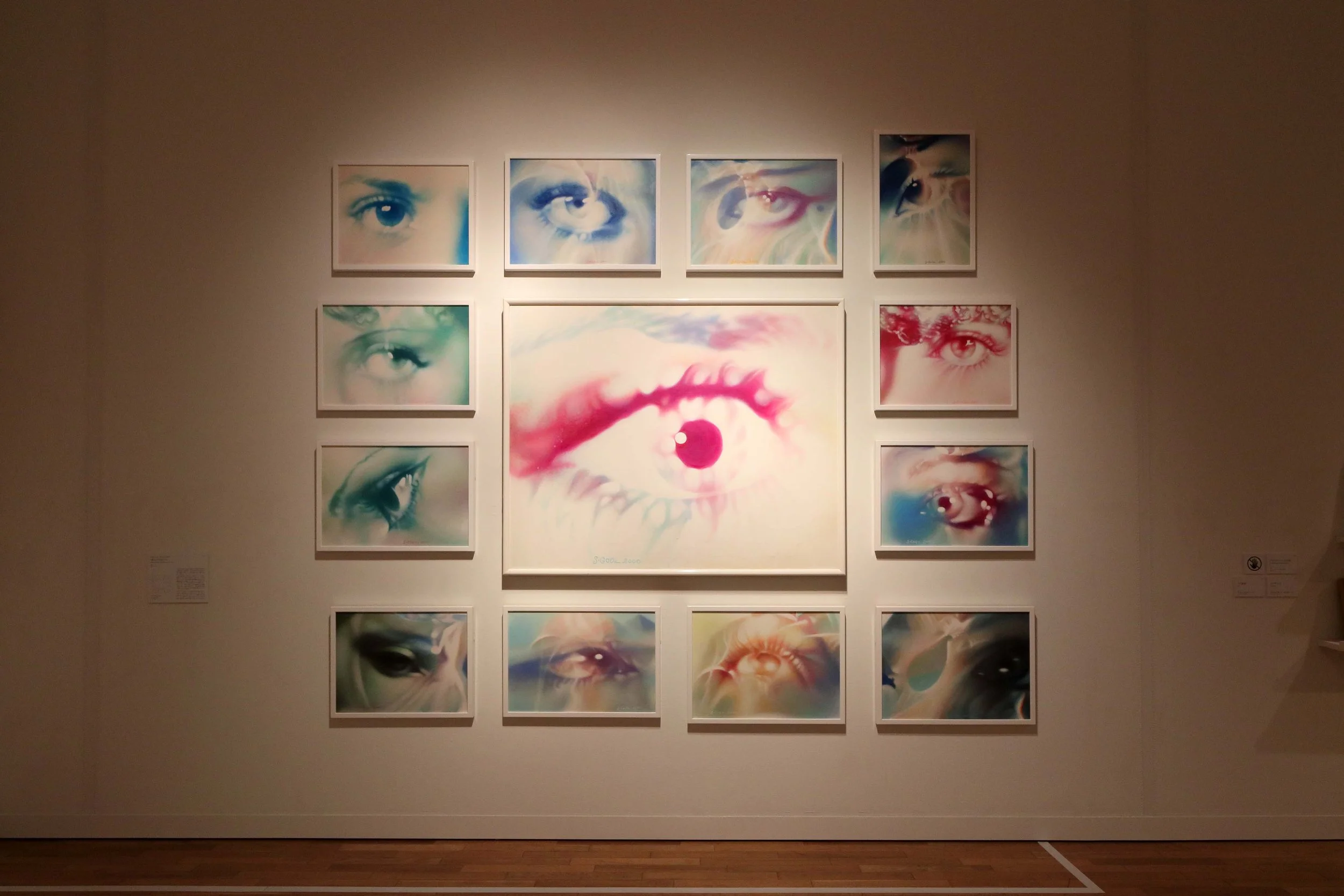
Banner image, Light behind unfinished traces by Mariana Castillo Deball
Meaning often lies in what is already around us, if we take the time to notice.


OvN-16029 Kindred
Kindred is a dusty pink that captures the tenderness of everyday moments and the delicacy of being fully here.
OvN-32010 Sensory
Fresh tone Sensory is a lime green that awakens the senses. It adds energy and life to the palette.
OvN-12034 Sol
Sol is a warm orange yellow that radiates warmth and a positive mood, reminding us that joy can be a slow experience.
OvN-16030 Carmine
Carmine is a deep, warm red that anchors the palette in human presence, full of life and the richness that comes from being together.
OvN-76005 Timbre
Timbre is a deep, dark brown that holds stillness and memory, grounding us in the familiar and what lasts.
OvN-71007 Reverie*
The full Reverie colour is a deep, elegant brown that adds warmth and richness, like polished wood or soft leather worn by time and care.


Left to right, Habitus experiments by Foscarini, TooGood & Frama, Tales Of Two Roads by Steven Cox, TooGood & Frama, outfit by La Cambre, painting by Georg Baselitz, Binaki, Athens by Dorothy Hood, stools by Dedar
Colour ways

Left to right, Memories of Terroir by Fanny Agren, Colour O'Clock by Pavarisar Vijitakula, The Light House series by Paulina Herrera Letelier

Left to right, Rainbow Trinity by Barbara Nessim, Strata by Lucia Massari, artwork by Laura Violeta Dima, La Casa Imperfetta by Inga Sempé

Left to right, Polymaternal by Miranda Forrester, Fear of Empty Space by Denisa Volakova, Ease Right Now by Ruth Effer, The Providers by Sofia Alves

Left to right, Herstory by Judy Chicago, Monoprint by Peter Schmidt, outfit by Stem, Ephemeral Truths: the Weight of Words by Ji A Yi


