
Colour directions 2026


Palette 2026

Vision 2025
Colour Flow 2025
Vision 2026
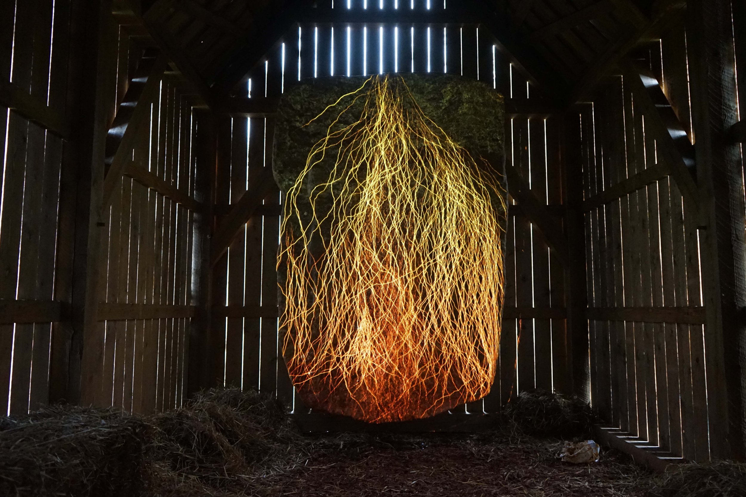
Light Tones
Tinted
The 2026 colour palette reflects a refined evolution from the big range of neutrals of the previous year that were light and natural. The light tones are transitioning to nuanced, tinted light shades with subtle undertones of pastel hues, imparting a sense of soft tranquility.
Colour shifts 2025-2026
Warmth
Warmer
For the 2026 palette, there’s a noticeable shift towards warmer oranges, reds and browns, departing from the range of oranges of the previous palette to embrace earthy and clay tones and warm pinks to reds, while yellow tones take on a richer, warmer quality.
Green to Kakhi
Active
The colour palette witnesses a reduction in the range of greens, marking a departure from the previous year’s shades and an emphasis on earthy greens to brown. Previously, blues and greens had evolved representing infinity, calm, and future technology, but this year, greens take on a sportive quality, embodying the vibrant hues of the outdoors alongside two clear, vibrant tones.
Blues and Purple
Interacting
The previously broad range of greyish lilacs and blues has undergone refinement, with a sharper focus on defined purple and blue hues. Last year’s harmonious evolution of lilacs and purples continues to influence the palette, particularly in how these tones interact with the important grey shade, which possesses the unique ability to render the invisible visible.
Colour Groups
A sense of renewal and revitalization
The 2026 colour palette is harmonious and balanced with a notable emphasis on natural hues, ranging from greens to warm oranges and browns, evoking a sense of earthiness and energy. Yellow, orange to brown, and the range of pinks to burgundy tones are important ranges. Within this palette, deep purple tones are expanding in range, adding depth and intrigue to the overall scheme. The tonal ranges of shades such as yellows, pinks, blues, and greens, give the pallete a sense of tranquility and elegance.
The green element in Eon suggests regenerative growth, renewal, and vitality, which are key attributes of nature. This connection to the natural world can create a calming and refreshing atmosphere for outdoor clothing as well as indoor spaces, making it ideal for areas where tranquillity and relaxation are priorities.
The importance of the colour Victory lies in the unique way it can be used to evoke different moods and themes in various contexts. The yellow undertones in the Victory colour bring energy and brightness; it can lift spirits and energize. It harmonizes with diverse materials, creating visual and emotional connections.
Mellow is an elegant and versatile colour, it expresses different sensations when applied to various materials. This colour can lift spirits and energize a space, making it a great choice for spaces where engagement and focus are desired.
The red aura of Solar Flare enhances the visual impact of an object, making it stand out or blend in with the surroundings. This can be particularly effective in automotive, accessories and interior design, where the choice of colour can significantly affect the item's appeal and perceived value. The colour can inject life into a palette, just like how it bursts from the sun, it embodies energy.


