Colour Update
Vision 2027
Colour And The Future
The systems that have governed how we make, distribute, and consume are undergoing fundamental shifts that touch every aspect of creative work. The restructuring of the relationships between technology and craft demands fluidity with new tools and techniques, and in a broader scope, the fundamental reconsideration of what design and colour work mean and who it serves.
Whether we are navigating supply chain disruptions, embracing regenerative growth cycles, rediscovering the rituals of craftsmanship, or integrating intelligent systems, we work with multiple temporalities simultaneously. The pace of technological change coexists alongside the slow rhythms of ecological systems; the immediate needs of global markets intersect with the patient work of local communities; the instant feedback of digital interfaces must accommodate the generational timescales of cultural change. Designers need to be fluent in this complexity to create work that responds to immediate needs while building toward futures that may unfold over decades.
What makes this period unique is the simultaneity of transformation across all domains. Economic, technological, environmental, social, and emotional systems are shifting. This interconnectedness means that every design decision has become a systems decision, requiring us to think toward broader consequences and relationships.
The intelligence that designers must cultivate now is both analytical and intuitive, encompassing the precision to work with complex data and technological systems, while maintaining the sensitivity to honour human nature and emotional authenticity.
Download the PDF of the report here
*The Colour box will be sent on the 8th of September 2024
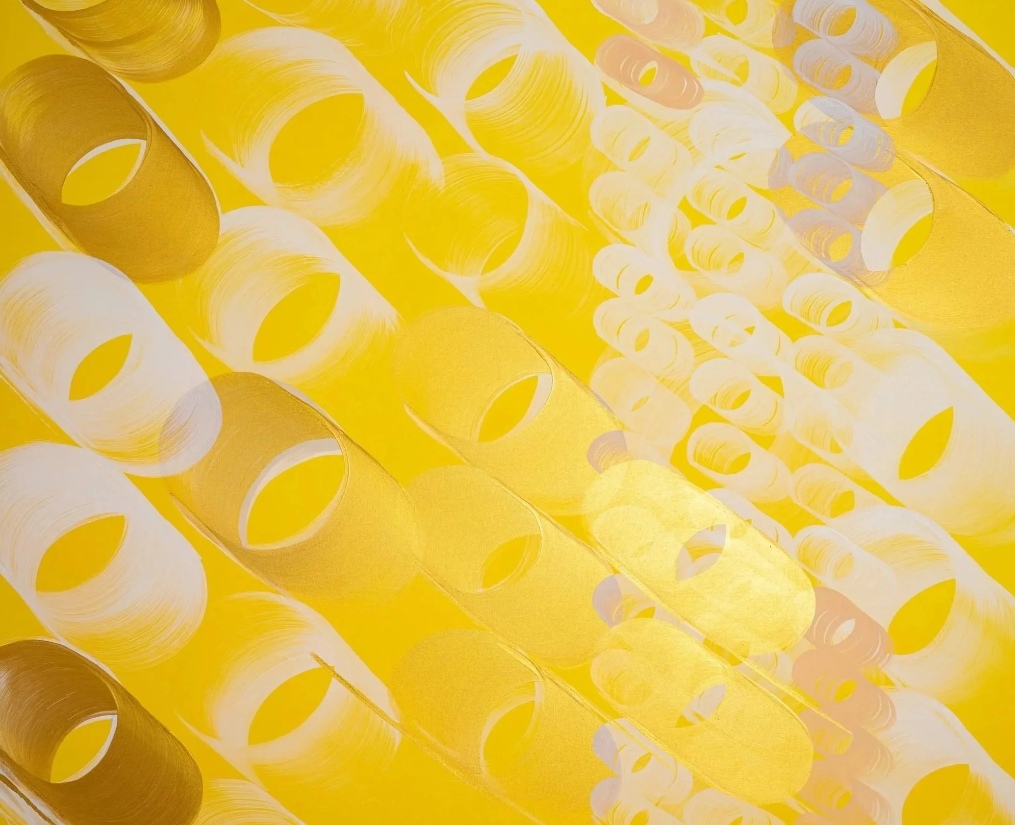
Banner, Ode to O by Sneha Shrestha
The tension between optimization and resilience, between what can be measured and what must be felt, to work creatively within them, developing approaches that are pragmatic and poetic. This requires a new kind of professional courage, the willingness to slow down when others are accelerating, to choose complexity when simplification is demanded, to invest in relationships when transactions seem more efficient.
The work ahead is not just about making things look good or function well, but about helping to shape the conditions under which life itself can thrive. In this context, every colour choice, every material decision, every concept becomes an act of world-building, a small but significant contribution to the kind of future we want to inhabit.
In the colour box, you will the 24 cotton strip OvN colours, and the colours printed on paper cards. During the creation phase, the colours are hand-painted, selected in the OvN studio, and dyed in cotton by our partner to meet our exact standards. The cotton strips are the primary reference. We translate the colours into the nearest Pantone shade, but the OvN standard is the intended colour.
Enjoy!
In shifting systems, colour becomes an anchor and a catalyst: grounding uncertainty while opening pathways toward renewal.
Overview Update Vision 2027
*Keycolour

Unsettled Ground engages with colour as a stabilising force and explores how colour can provide a sense of grounding and connection during times of instability, uncertainty, and unexpected change.
Directions 2027 Update

The Slow Shift explores how the birth of something new takes time. It reveals that new systems and ideas require care, patience, consistency and conscious creativity to grow and reach maturity.

Richness of Reality celebrates colour as a way to reconnect with everyday life, grounding us in warmth, nostalgia and the quiet joy of being present. It embraces contradictions and plays satirically, questioning outdated values.

Encoded Intelligence draws inspiration from the current industrial revolution. It reflects a world increasingly shaped by complex systems and networks, exploring how these changes redefine what it means to be human.
1/ Unsettled Ground
The orange colour Interglow is a warm tone that carries the intensity of the sun at its peak.In a time when materials, prices, and traditions are being questioned, Interglow stands as a stabilising signal, bright enough to inspire, grounded enough to connect.
Key colours
2/ The Slow Shift
3/ Richness of Reality
4/ Encoded Intelligence

Veiled is a light, quiet colour that points toward cleaner processes, renewable energy, and regenerative materials. It embodies living within the Earth’s limits, acknowledging finite resources while inspiring slower, more conscious and limited ways of living and designing.
Reverie evokes both modern and traditional associations as a colour of opulence and luxury, reminiscent of a time when quality was valued, before mass production made things cheap and disposable. It speaks to timelessness, permanence, and products meant to be treasured for life.
Random is a grey that embodies the tension between systems, control, and human intuition. It reflects the coexistence of structure and emotion, showing that logic and feeling can strengthen one another. It calls for respect, ownership, and agency in a world increasingly governed by machines.
Shades Vision 2027

The 2027 update palette shows a clear balance. The emphasis moves toward the spectrum of orange-reds alongside a deepened range of blues. Greens are present but more restrained, while supporting tones such as browns and pinks now play a secondary role. This creates a more focused palette, where warmth and depth are supported by stability and fluidity.
Overview Update Vision 2027

Overview Update Vision 2027

The complete 2027 palette shows a shift toward earthier warmth: orange tones step in where yellows once were. Browns diversify, appearing in both reddish and greenish variations. Blues remain present, leaning toward green undertones, and purples are followed up by greyish tones. Reds soften into pinks and deepen into richer, darker red and burgundy shades, creating a rich, balanced, grounded palette.
Vision 2027
Update Vision 2027
Light tones
Shift Update Vision 2027
Warmth

The palette shows a broad range of yellows, oranges, and reds. Where the first version leaned toward browns, the update expands into richer oranges and deeper reds. The warm spectrum broadens and gains definition.
Green natural

The first 2027 palette showed a broad range of greens, from blueish tones to brownish variations. In the update, this has been reduced to a more concentrated set of three balanced greens. The shift suggests a deliberate refinement: less variety, but more clarity.
Blue space

The blues form a balanced and expanding range. In the update, we see fewer lilac undertones compared to 2026, giving way to darker, more atmospheric shades. This shift deepens its character. The blues have dual roles: on one side, they can act as conservative and stable tones; on the other, they offer fluidity and lightness, creating both structure and openness.

Compared to the broader range of neutrals in 2026, the 2027 palette relies on fewer tones. Almost white, they offer a sense of space and calm, sometimes softened with a creamy warmth, at other times touched by the lightest green. These neutrals add breathing room and give space to the colours around them.
Pantone Translation

The PANTONE © reference numbers shown represent the PANTONE © colors most closely related to the Oltmans van Niekerk colours displayed. PANTONE © and other Pantone trademarks are property of Pantone LLC. PANTONE colours displayed here may not match PANTONE - identified standards. Consult current PANTONE Color publications for accurate colour. Pantone LLC is a wholly owned subsidary of X-Rite. Incorporated.


